#Designsystem
#Figma
Design System
Design System
Design System
Design System
Design System
Design System
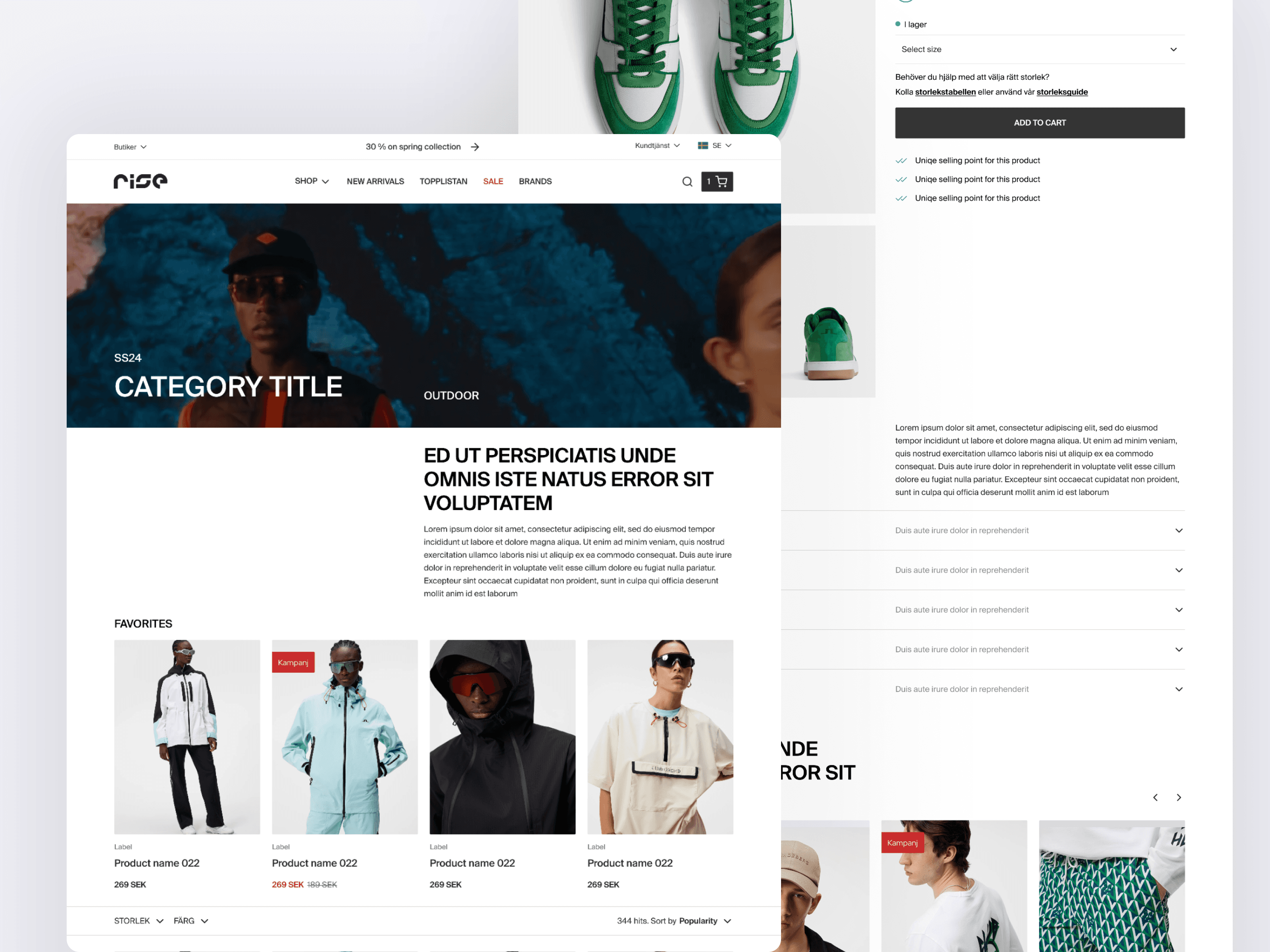
As a UX/UI designer, I developed a complete design system to ensure consistency, efficiency, and scalability across the web in the organization.
As a UX/UI designer, I developed a complete design system to ensure consistency, efficiency, and scalability across the web in the organization.
As a UX/UI designer, I developed a complete design system to ensure consistency, efficiency, and scalability across the web in the organization.
As a UX/UI designer, I developed a complete design system to ensure consistency, efficiency, and scalability across the web in the organization.
As a UX/UI designer, I developed a complete design system to ensure consistency, efficiency, and scalability across the web in the organization.
As a UX/UI designer, I developed a complete design system to ensure consistency, efficiency, and scalability across the web in the organization.


Digital Designer (UX/UI)
Role
Digital Designer (UX/UI)
Role
Background
Background
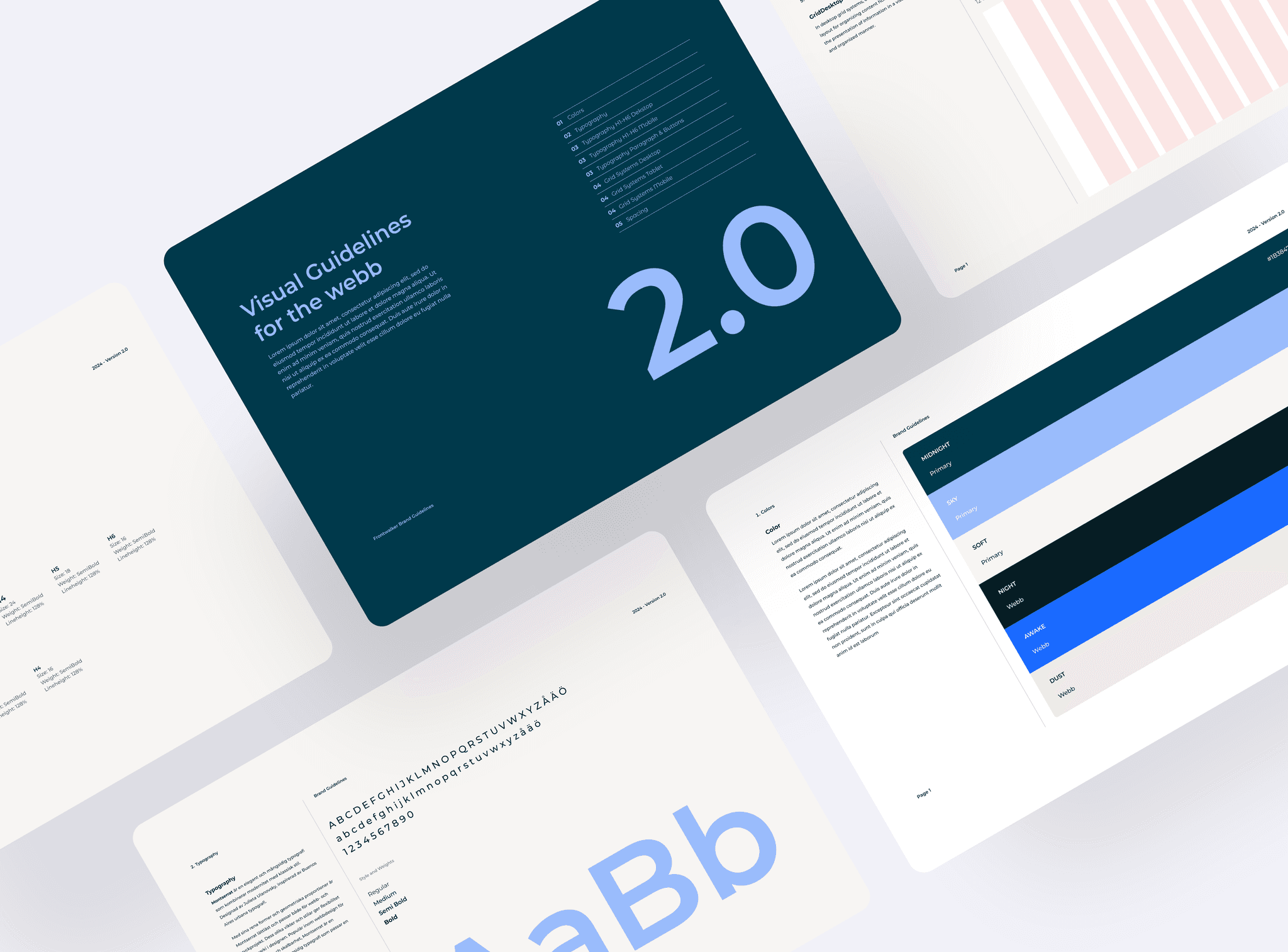
The goal of this project was to create a unified design system that would streamline the design process, help collaboration, and keep visual and functional consistency across the web. The design system included guidelines and resources such as colors, typography, grid system, spacing, and a component library. Everything was designed with accessibility and WCAG standards in mind.
The goal of this project was to create a unified design system that would streamline the design process, help collaboration, and keep visual and functional consistency across the web. The design system included guidelines and resources such as colors, typography, grid system, spacing, and a component library. Everything was designed with accessibility and WCAG standards in mind.
Goals
Goals
The main goal was to create a consistent design framework that all teams could easily use for web products. This included:
Defining a consistent color palette to ensure brand uniformity.
Selecting typographic styles that improved readability and visual appeal.
Implementing a grid system to support structured and balanced layouts.
Establishing spacing rules to maintain visual harmony across web interfaces.
Ensuring the design system met accessibility standards and WCAG guidelines.
Creating a well-documented component library to promote reusability and speed up the design and development process.
Solutions
Solutions
To achieve these goals, I created a detailed color palette that represents the brand's identity and works well across different parts of the website. I made sure the colors also meet guidelines that help people with vision challenges easily read text and interact with the site. I chose fonts, sizes, and styles carefully to make sure text is easy to read on all devices, from phones to desktops.
The layout of the website adjusts smoothly to different screen sizes and orientations, thanks to a grid system I designed. I set rules for spacing to keep everything looking balanced and consistent, which improves how users feel using the site. I also built a library of components like buttons, forms, and navigation bars. Each part of the library is flexible and can be adjusted easily.
It was important to us that every part of the design meets accessibility standards, so everyone can use the site easily, no matter their abilities. This careful planning means the design works well and can grow in the future. It ensures everyone can use the site easily and sets a strong foundation for future updates and improvements.
Tools
Tools
Figma
