#E-commerce
#E-commerce
#E-commerce
#Figma
#Figma
#Figma
Checkout
Checkout
Checkout
Checkout
Checkout
Checkout
As a UX/UI designer, I conducted user research and analyzed data to identify pain points in the checkout process. Using these insights, I optimized the flow to reduce friction, improve the user experience, and drive higher conversions through data-informed design decisions.
As a UX/UI designer, I conducted user research and analyzed data to identify pain points in the checkout process. Using these insights, I optimized the flow to reduce friction, improve the user experience, and drive higher conversions through data-informed design decisions.
As a UX/UI designer, I conducted user research and analyzed data to identify pain points in the checkout process. Using these insights, I optimized the flow to reduce friction, improve the user experience, and drive higher conversions through data-informed design decisions.
As a UX/UI designer, I conducted user research and analyzed data to identify pain points in the checkout process. Using these insights, I optimized the flow to reduce friction, improve the user experience, and drive higher conversions through data-informed design decisions.
As a UX/UI designer, I conducted user research and analyzed data to identify pain points in the checkout process. Using these insights, I optimized the flow to reduce friction, improve the user experience, and drive higher conversions through data-informed design decisions.
As a UX/UI designer, I conducted user research and analyzed data to identify pain points in the checkout process. Using these insights, I optimized the flow to reduce friction, improve the user experience, and drive higher conversions through data-informed design decisions.


Digital Designer (UX/UI)
Role
Digital Designer (UX/UI)
Role
Background
Background
My role as a UX/UI designer focused on improving how customers complete their purchases online. Many users were leaving the checkout process without finishing their orders because it was too complicated and took too long. By user research studying how people interacted with the site, we identified these issues and set out to make things easier.
My role as a UX/UI designer focused on improving how customers complete their purchases online. Many users were leaving the checkout process without finishing their orders because it was too complicated and took too long. By user research studying how people interacted with the site, we identified these issues and set out to make things easier.
Goals
Goals
Simplify the Checkout Process:
Our main goal was to make buying things online simpler. By reducing the number of steps needed to make a purchase, we aimed to make it easier for users to finish buying what they wanted. To achieve this, we analyzed the data and did user research
Simplify the Checkout Process:
Our main goal was to make buying things online simpler. By reducing the number of steps needed to make a purchase, we aimed to make it easier for users to finish buying what they wanted. To achieve this, we analyzed the data and did user research
Simplify the Checkout Process:
Our main goal was to make buying things online simpler. By reducing the number of steps needed to make a purchase, we aimed to make it easier for users to finish buying what they wanted. To achieve this, we analyzed the data and did user research
Simplify the Checkout Process:
Our main goal was to make buying things online simpler. By reducing the number of steps needed to make a purchase, we aimed to make it easier for users to finish buying what they wanted. To achieve this, we analyzed the data and did user research
Simplify the Checkout Process:
Our main goal was to make buying things online simpler. By reducing the number of steps needed to make a purchase, we aimed to make it easier for users to finish buying what they wanted. To achieve this, we analyzed the data and did user research
Simplify the Checkout Process:
Our main goal was to make buying things online simpler. By reducing the number of steps needed to make a purchase, we aimed to make it easier for users to finish buying what they wanted. To achieve this, we analyzed the data and did user research
Create a clear and intuitive user experience
We wanted the checkout process to be as clear as possible. This meant making sure users always knew where they were in the checkout and what they had left to do.
Create a clear and intuitive user experience
We wanted the checkout process to be as clear as possible. This meant making sure users always knew where they were in the checkout and what they had left to do.
Create a clear and intuitive user experience
We wanted the checkout process to be as clear as possible. This meant making sure users always knew where they were in the checkout and what they had left to do.
Create a clear and intuitive user experience
We wanted the checkout process to be as clear as possible. This meant making sure users always knew where they were in the checkout and what they had left to do.
Create a clear and intuitive user experience
We wanted the checkout process to be as clear as possible. This meant making sure users always knew where they were in the checkout and what they had left to do.
Create a clear and intuitive user experience
We wanted the checkout process to be as clear as possible. This meant making sure users always knew where they were in the checkout and what they had left to do.
Prevent checkout abandonment
To keep people from leaving before finishing their purchase, we focused on removing distractions. We made sure users could always see what was in their cart and simplified the header so they wouldn't be tempted to click away.
Prevent checkout abandonment
To keep people from leaving before finishing their purchase, we focused on removing distractions. We made sure users could always see what was in their cart and simplified the header so they wouldn't be tempted to click away.
Prevent checkout abandonment
To keep people from leaving before finishing their purchase, we focused on removing distractions. We made sure users could always see what was in their cart and simplified the header so they wouldn't be tempted to click away.
Prevent checkout abandonment
To keep people from leaving before finishing their purchase, we focused on removing distractions. We made sure users could always see what was in their cart and simplified the header so they wouldn't be tempted to click away.
Prevent checkout abandonment
To keep people from leaving before finishing their purchase, we focused on removing distractions. We made sure users could always see what was in their cart and simplified the header so they wouldn't be tempted to click away.
Prevent checkout abandonment
To keep people from leaving before finishing their purchase, we focused on removing distractions. We made sure users could always see what was in their cart and simplified the header so they wouldn't be tempted to click away.
Solutions
Solutions
One-page checkout with progress bar
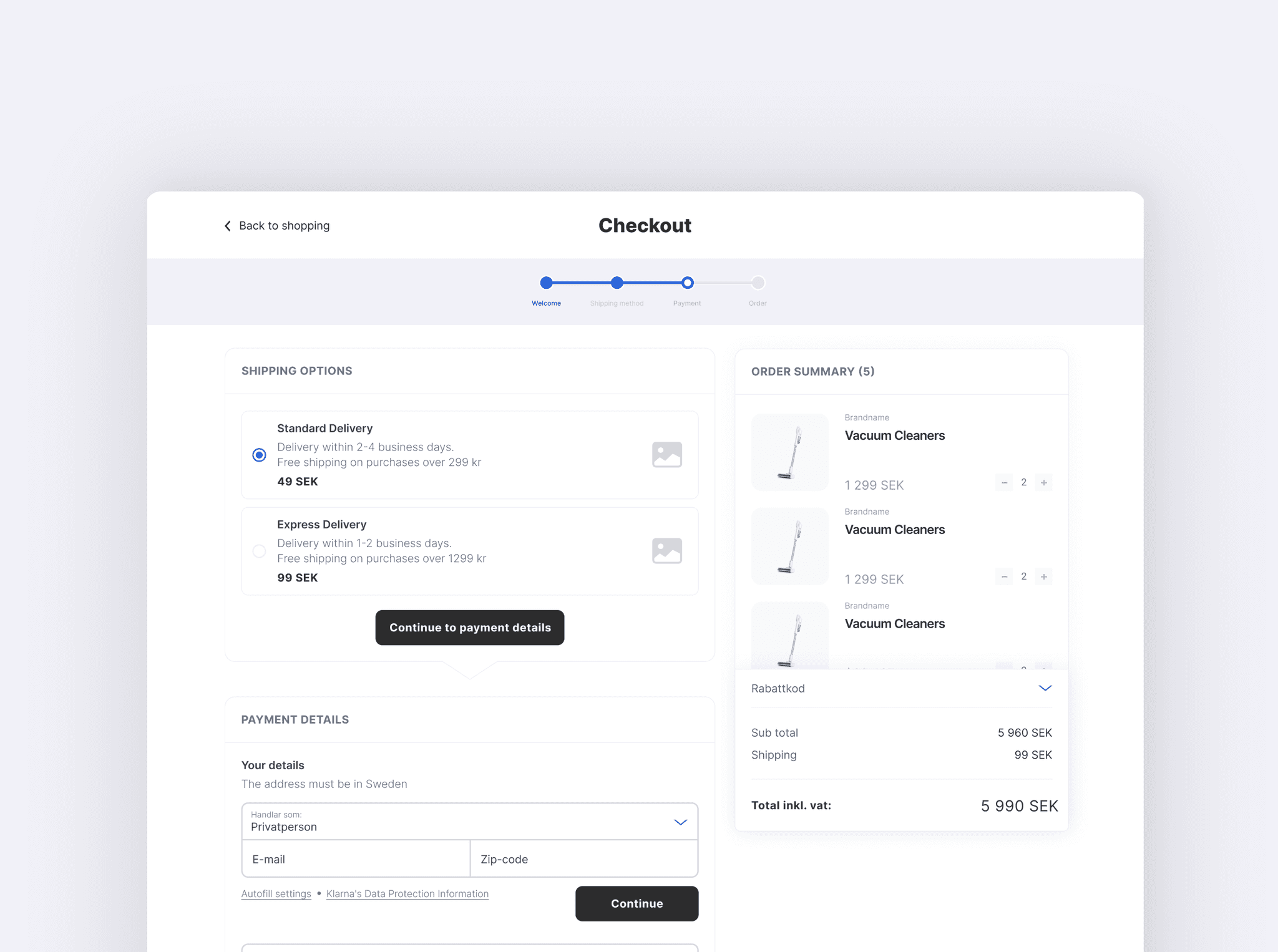
We designed the checkout to happen on just one page. This made it quicker and easier for users to complete their purchases. A progress bar showed them how far along they were in the process.
One-page checkout with progress bar
We designed the checkout to happen on just one page. This made it quicker and easier for users to complete their purchases. A progress bar showed them how far along they were in the process.
One-page checkout with progress bar
We designed the checkout to happen on just one page. This made it quicker and easier for users to complete their purchases. A progress bar showed them how far along they were in the process.
One-page checkout with progress bar
We designed the checkout to happen on just one page. This made it quicker and easier for users to complete their purchases. A progress bar showed them how far along they were in the process.
One-page checkout with progress bar
We designed the checkout to happen on just one page. This made it quicker and easier for users to complete their purchases. A progress bar showed them how far along they were in the process.
One-page checkout with progress bar
We designed the checkout to happen on just one page. This made it quicker and easier for users to complete their purchases. A progress bar showed them how far along they were in the process.
Clearly visible cart
We made sure the cart was always visible during checkout. This helped users keep track of what they were buying and reduced any worries about what was in their cart.
Clearly visible cart
We made sure the cart was always visible during checkout. This helped users keep track of what they were buying and reduced any worries about what was in their cart.
Clearly visible cart
We made sure the cart was always visible during checkout. This helped users keep track of what they were buying and reduced any worries about what was in their cart.
Clearly visible cart
We made sure the cart was always visible during checkout. This helped users keep track of what they were buying and reduced any worries about what was in their cart.
Clearly visible cart
We made sure the cart was always visible during checkout. This helped users keep track of what they were buying and reduced any worries about what was in their cart.
Clearly visible cart
We made sure the cart was always visible during checkout. This helped users keep track of what they were buying and reduced any worries about what was in their cart.
Simplified header
We removed links to other products or categories from the header during checkout. This kept users focused on finishing their purchase without getting distracted.
Simplified header
We removed links to other products or categories from the header during checkout. This kept users focused on finishing their purchase without getting distracted.
Simplified header
We removed links to other products or categories from the header during checkout. This kept users focused on finishing their purchase without getting distracted.
Simplified header
We removed links to other products or categories from the header during checkout. This kept users focused on finishing their purchase without getting distracted.
Simplified header
We removed links to other products or categories from the header during checkout. This kept users focused on finishing their purchase without getting distracted.
Simplified header
We removed links to other products or categories from the header during checkout. This kept users focused on finishing their purchase without getting distracted.
Tools
Tools
Figma
Jira
